Yet you and yo mama will be getting a copy. (y)MW3. *COD Biasism*
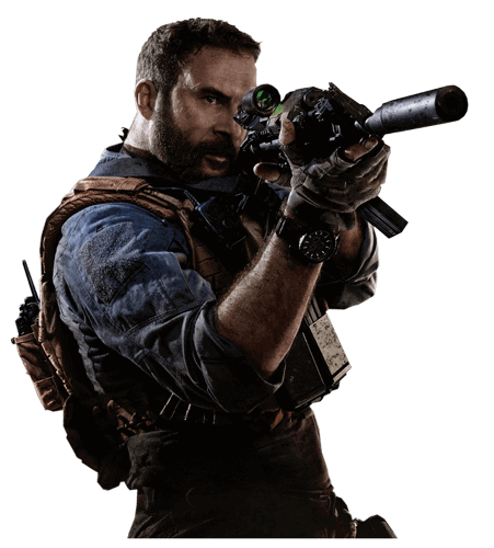
Yet you and yo mama will be getting a copy. (y)MW3. *COD Biasism*

4 days later. It's cool though.I'm finishing my new one tomorrow.
depends (10)Con want to make us a banner? hahahahahaha
Maybe i will accidently early lift on your ban for you other account if you make a banner we all like...depends (10)

LOL (10 Char)Maybe i will accidently early lift on your ban for you other account if you make a banner we all like...
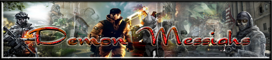
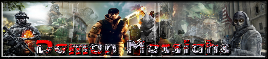
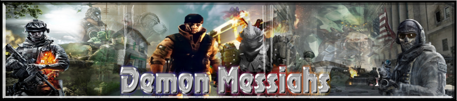
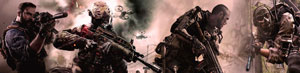
Not trying to attack you, but just from A GFX stand point, these are bleneded horribly, sorry.1.
2.
3.
4.
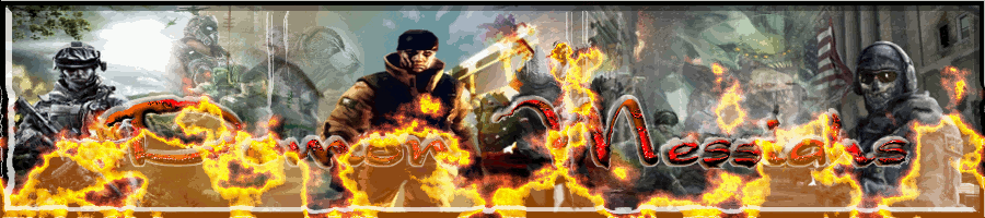
5. Animated?
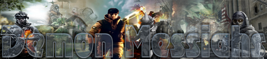
Still ain't done....but just want to see if I'm on the right track......
Things to try:
Place the animated fire layer between text layer and banner background.....so easier to read text....
Then post yours, or shut the fuck up. Thanks.Not trying to attack you, but just from A GFX stand point, these are bleneded horribly, sorry.
I was gonna say that a bit nicer but that also works lolThen post yours, or shut the fuck up. Thanks.
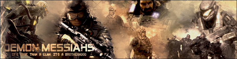
BTW, I made that when I wasn't the best with smudge tool... and one thing he could have done to have improved his blending, is make the colors universal, with either a cooling or warming filter and some gradient maps, possibly some exposure layers, and some curves. I mean, there is a lot more that goes into a good banner that most people don't realize, so I was simply giving him a pointer to improve upon to make a better banner.
When i put Bear's(on top) next to DL's(on bottom), i think DL's blending is much better. Bear, yours looks like all you did to blend things was use the smudge tool...
 Welcome to CoDwarfare!